FARMING HOPE REDESIGN - CLIENT PROJECT
About the Project
The Challenge:
Farming Hope’s website had poor information architecture which led to user navigation issues and lower donations. Needing to attract more donors, they reached out to us to redesign their website.
My Contributions:
Product Designer and Project Manager
User Research, Prototyping, Hi-Fidelity Mockups, and Testing
Team:
Audra Miller, Mish Burton, Celeste Lopez, Niki Nicknejad, Nattie Srisutthi
Tools Used:
Figma, Miro, Lucidchart, Trello

The Process
Empathize
Proto Persona
User Interviews
Online Survey
Define
Affinity Diagram
User Persona
Competitor Analysis
Ideate
Feature Prioritization Matrix
Storyboarding
Prototype
Wireframe Sketches
Lo Fidelity Wireframes
Lo Fidelity Prototype
Test
Usability testing
Hi Fidelity Prototype
User testing
Refine
Next Steps
KPIs

Empathize
Research and Problem Definition
Who is farming hope?
Farming Hope is a garden-to-table job training nonprofit located in San Francisco. They offer paid, empowering transitional employment in their garden and kitchen with formerly incarcerated or unhoused neighbors.
Farming Hope’s Original Website
Research
Interviews
Interviewee Criteria
Individuals all between the age ranges of 25 and 35
Frequent donors (more than three times a year)
Organization Stakeholders
Research Objectives
To discover the main factors that inspire individuals to donate (time/ money) to an organization
To figure out how people normally find organizations to support (Through work, word of mouth, searching online, etc)
“I prefer to support organizations that let me know where their money goes.”
— Miriam
“I love being able to see images of the people I’ve helped. It feels great knowing that my time and energy have been put to good use.”
— Caleb
Online Survey
We sent out a 9 question online survey to gather insight into what compels donors to donate and what qualities they want to see in the organizations they support. We had 144 responses and the top findings were:
A majority of donors make donations via cellphones.
Highest rated feature a donor wants to see on an organization’s site is a description of where their money goes.
Donors are more compelled to donate when they feel a personal connection to the cause.

Define
Identifying Key Issues and User Insights
Affinity Diagram
What we discovered:
Donors want to clearly see what the organization does
Donors want specific projects to donate to
Donors feel rewarded when they can recognize that their money makes a direct impact
User Persona
Competitive Analysis
I collected five other non profits in the Bay Area who provided food related or job training services. The Town Kitchen had a very cohesive site with interactive videos and engaging infographics which really made it stand out. Farming Hope had most of the elements, but they only had one or two examples on their website of each. They also do not have an easily accessible annual report on their site, which would need to be included in the redesign.

Ideate
Brainstorming and Prioritizing
Feature Prioritization Matrix
Features decided upon to be included in redesign:
Imagery and stories of real people affected by the organization
A link to view the annual report
An online ordering platform to promote their social enterprise business
Storyboard
The user story was established and communicated through a storyboard to express how it would play out from a user’s perspective. I drew this storyboard.
User Flows
The three main flows we decide to build upon were 1. Donate, 2. Order food, and 3. Subscribe to the newsletter. I designed these user flow displays in LucidChart.

Prototype
Developing Layouts and Formulating
Wireframe Sketches
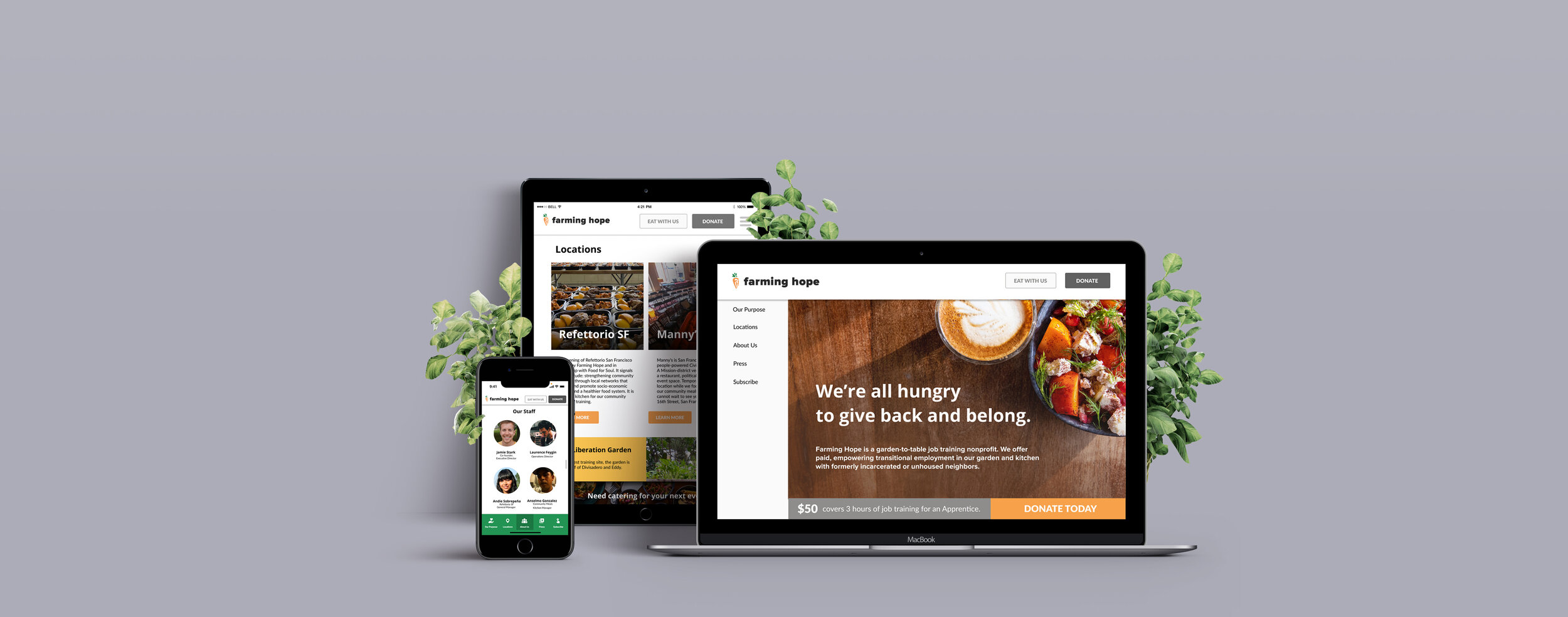
Based on user interviews it was clear that donors want to easily figure out what the organization does and how they help others when visiting their website. I wanted to design out a single page website layout to accomplish this with a side navigation bar. My sketch is shown here.
We each drew up different sketch ideas and then combined the top elements from each into a lo fidelity wireframe.
Lo Fidelity Wireframes

Test
Testing Prototypes and Iterating
Lo Fi User Testing
We conducted three user tests on our website prototype.
The three tasks tested were:
Locate a news article on their site
Subscribe to the organization’s newsletter
Give money to the organization
Seven of the nine tasks were completed successfully. Multiple users had difficulty locating the news articles on the site due to lack of press section in navigation and unclear layout of single page to encourage scrolling.
The main takeaways:
Layout of donation page was confusing with too many buttons. We needed to simplify.
Press needed to be its own section since users were not clear on the website scroll feature.
Style Guide
Farming Hope’s colors are orange and green but they wanted to expand their color palette. Their main partner is Refettorio, whose colors are gold and red. Farming Hope wanted to adjust their website to look more like a sister site to Refettorio’s so we added accent colors of red and gold to their color scheme, which created a very produce-centered look.
Hi Fidelity Wireframes
I led wireframing with assistance from one of my teammates. We used large blocks of color and imagery to break up the text on the site. The idea for the mobile version was to generate a navigation bar at the bottom instead of the side for better user access when traversing the website.
Hi Fi Testing
We tested the three same tasks on the updated website.
All tasks were completed successfully.
The main takeaways:
Some fonts were too small and easily ignored
Button colors failed Contrast Checker so needed to be switched from orange to gray
“Support Us” needed to be changed to “Donate” to prevent any initial confusion from users

Refine
Improving and Reiterating
Next Steps
Develop the “Eat with Us” page to start collecting catering orders
Create impact report microsite
Client is using Wordpress so setting up their site there is currently in the works
Key Performance Indicators to monitor:
Number of donations
Percentage of visitors that donate
Amount of users who subscribe to the newsletter
Number of orders made through the website


