

SHUTTERFLY DISNEY PARTNERSHIP
About the Project
The Challenge:
Disney’s existing photo printing service via a third party, EZPrints, was functional but lacked "life." Users felt the experience was disconnected from their broader journey, and there was no long-term value proposition for image storage or personalization.
The Goal:
For Disney: Modernize the CX and drive brand consistency across physical and digital touchpoints.
For Shutterfly: Acquire new customers by providing a frictionless "linking" flow and lifetime image storage.
For the User: Make the transition from Disney to Shutterfly feel like a value-add, not a chore, and provide them with an easy product creation experience after their trips.
My Contributions:
Senior Product Designer II
Testing, Prototyping & Testing, UI Design
Team:
Audra Miller
Tools Used:
DScout, User Testing, Figma, FigJam, FigmaMake
The Process
Empathize
Proto Persona
User Wire Flows
Define
User Testing
Red Lining
Competitive Analysis
Ideate
Mood Board
Lo Fidelity Wireframes
Site Map
Prototype
Wireframe Sketches
Lo Fidelity Wireframes
Lo Fidelity Prototype
Build
Creating Specs
A/B Testing
Hi Fidelity Prototype
2 Platforms
Refine
Next Steps
KPIs
Empathize
Research and Problem Definition
How does PhotoPass actually work?
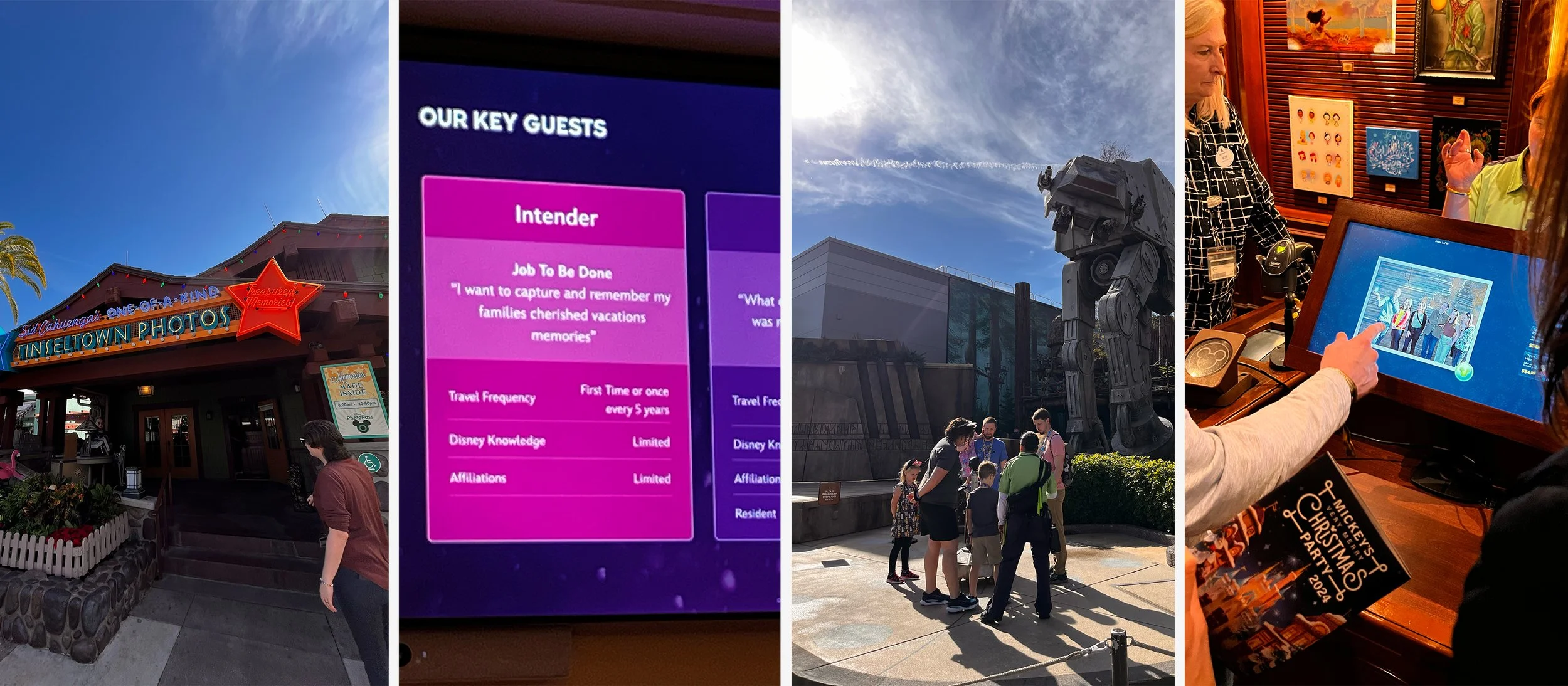
The leadership team and I traveled to Orlando, Florida to visit Disney World and get an in-person experience of being a guest at the Park. We wanted to see how visible the photographers were, how the ID photo linking worked, how quickly images transferred to guest photo accounts, and what photo printing possibilities were available in the park.
Who are the type of guests that come to Disney Parks?
What does their app interface look like?
How do they currently store images from PhotoPass
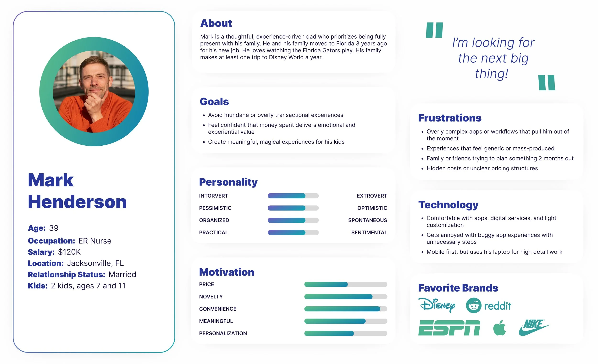
Proto Persona
After visiting Disney World and meeting their PhotoPass Team, I came up with a proto persona for a typical guest of Walt Disney Parks.
Current User Wire Flow
Typical User flow to order prints or products
On Photo Gallery Page, users can order individual prints.
User has to click away from their Photo Gallery on the Photo Products tab.
Then they need to scroll down the page to see the variety of products available.
After selecting a product an interstitial pops up to indicate transferring to a different site.
EZPrints opens up and user can select a design.
Define
Identifying Key Issues and User Insights
Initial Research
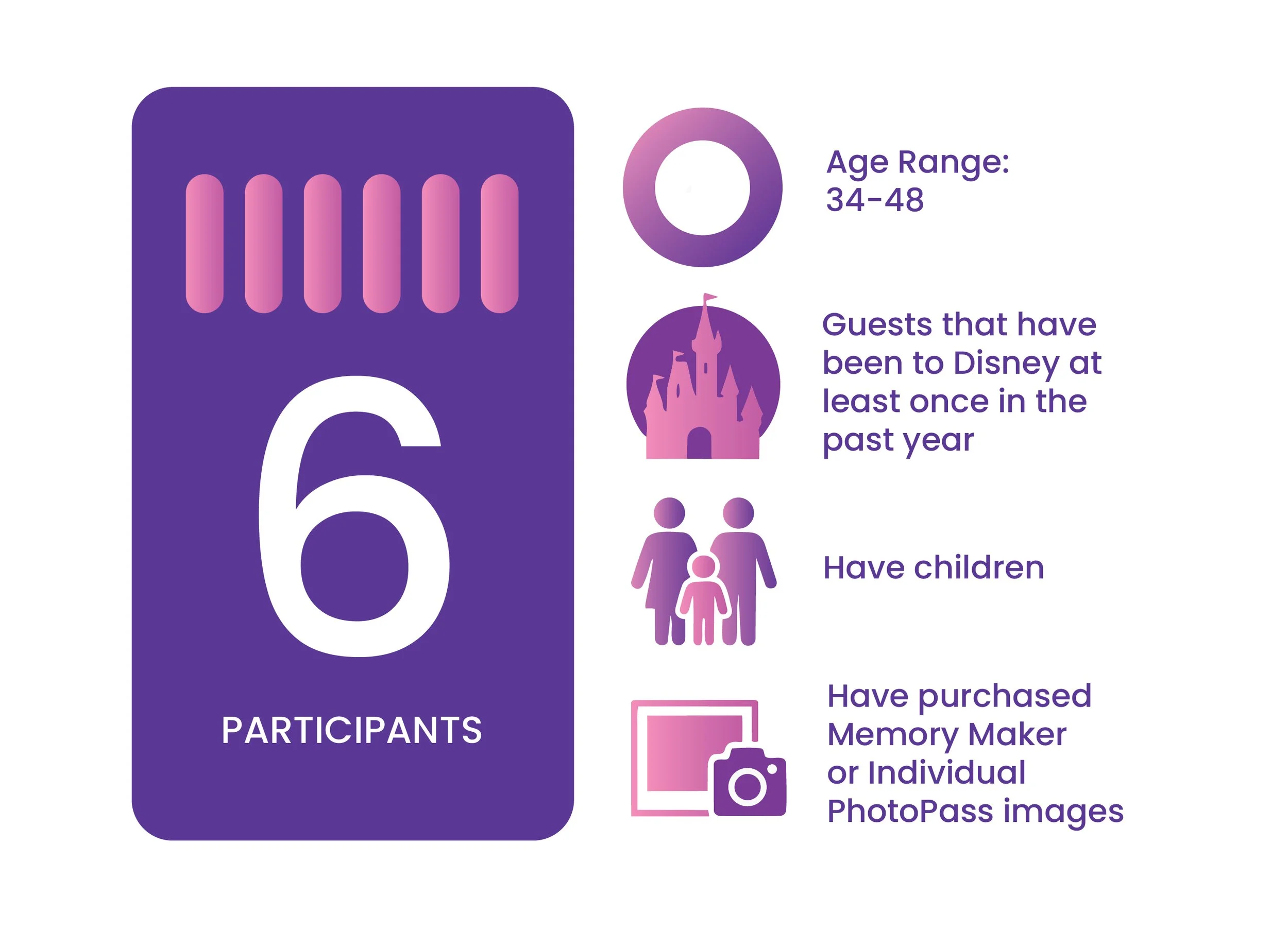
Usability Testing
To validate our pitch, I conducted a qualitative study with six individuals who had visited a Disney park within the last year. All users had children since the hypothesis was that a majority of users who participate in Disney’s Photo Pass experience were parents with their kids on a trip.
Testing Goals
Understand the Photo Memory Lifecycle
Uncover Purchase Decision Drivers & Barriers
Evaluate Product Discovery & Shopping Experience
Assess Emotional vs. Functional Value
Validate Future Opportunities
Product Decision Testing Takeaways
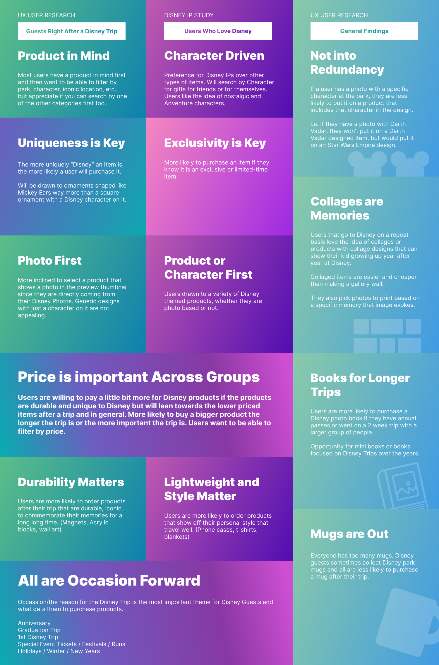
Our Customer Insights Team conducted a quantitative survey sent out to users who were fans of the Disney Brand to get insights on which characters or products were the most enticing. Analyzing both testing results, I constructed a comparative list of the top purchase driving factors for each so that our designs and our experience would meet both customers adequately. The top takeaways were:
Guests are Product First while Fans are Character First
Uniqueness and Exclusivity are Important
Guests have a photo in mind when shopping for a product
Guests are inspired by Durability while Fans are into showing off personal style
All are Occasion Forward
Key Insight: Users don't just buy "prints," they buy for "occasions." The motivation behind the photo (e.g., a holiday, a milestone) dictated the product choice and design aesthetic.
The Pivot: This led me to work with Merchandising and Creative teams to ensure the product catalog was curated based on "Occasion-Based Logic" rather than just generic categories.
EZ Prints User Testing Pain Points
As I asked users about their experience printing and ordering photo products from Disney, there were four main paint points that users expressed around the current printing experience.
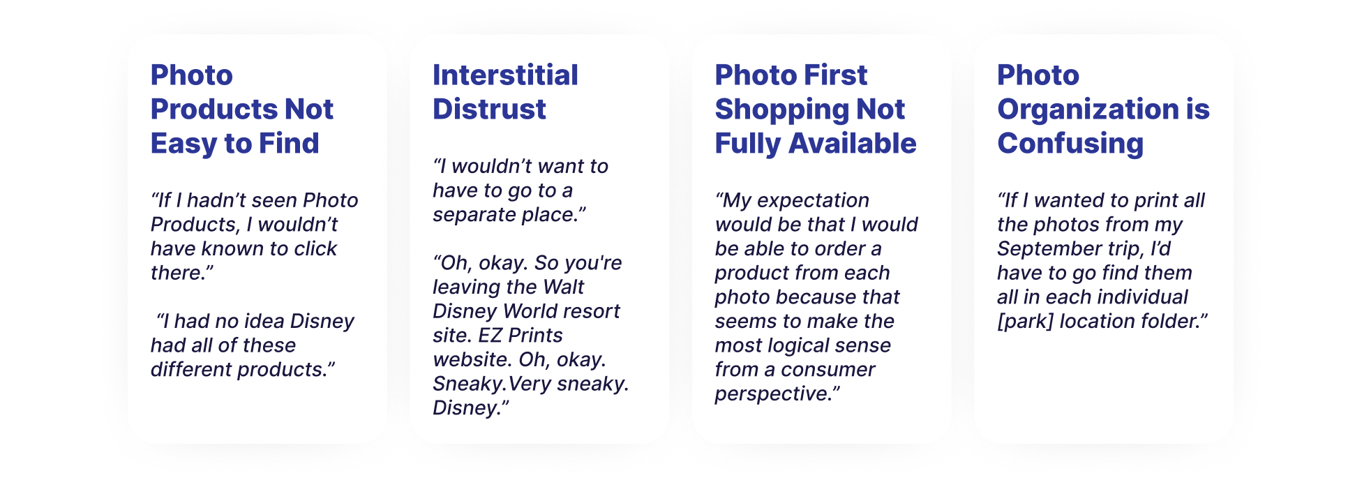
Potential solutions to design for those pain points.
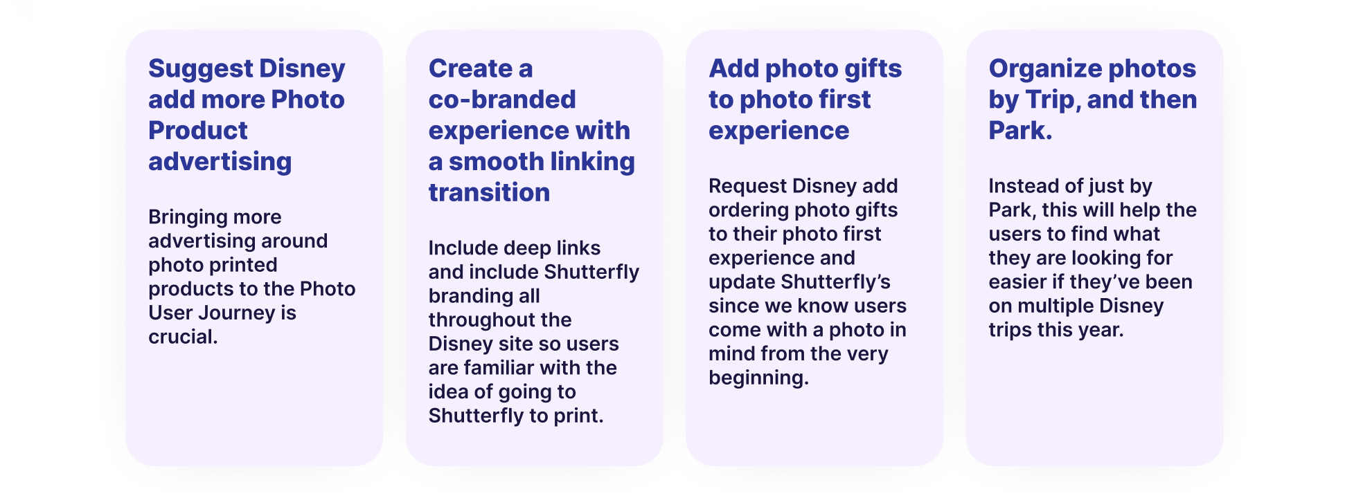
Proposed Solution - Three Main Pillars.
Pillar 3:
Intelligent Asset Management
Transferring images is only half the battle; finding them later is the real utility.
Feature: I designed new organizational structures for transferred images, allowing Willow users to easily filter and locate their "Willow Moments" within their larger Shutterfly account.
Pillar 2:
The "Site-within-a-Site" Experience
I created a custom shopping and thumbnail page that lived within the Willow ecosystem.
Execution: This required balancing Willow’s branding with Shutterfly’s UI components to ensure users felt a sense of continuity.
Innovation: A redesigned thumbnail page that prioritized "life" and movement over a static grid.
Pillar 1:
The Seamless Linking Flow
I designed a promotional flow that incentivized users to connect their accounts.
Feature: "Personalized Marketing." By showing the user’s own images on product thumbnails during the pitch, we increased the emotional resonance of the partnership.
Design Goal: Minimize friction while maximizing the "wow" factor of seeing their photos instantly appear on high-quality Shutterfly products.
Ideate
Brainstorming and Prioritizing
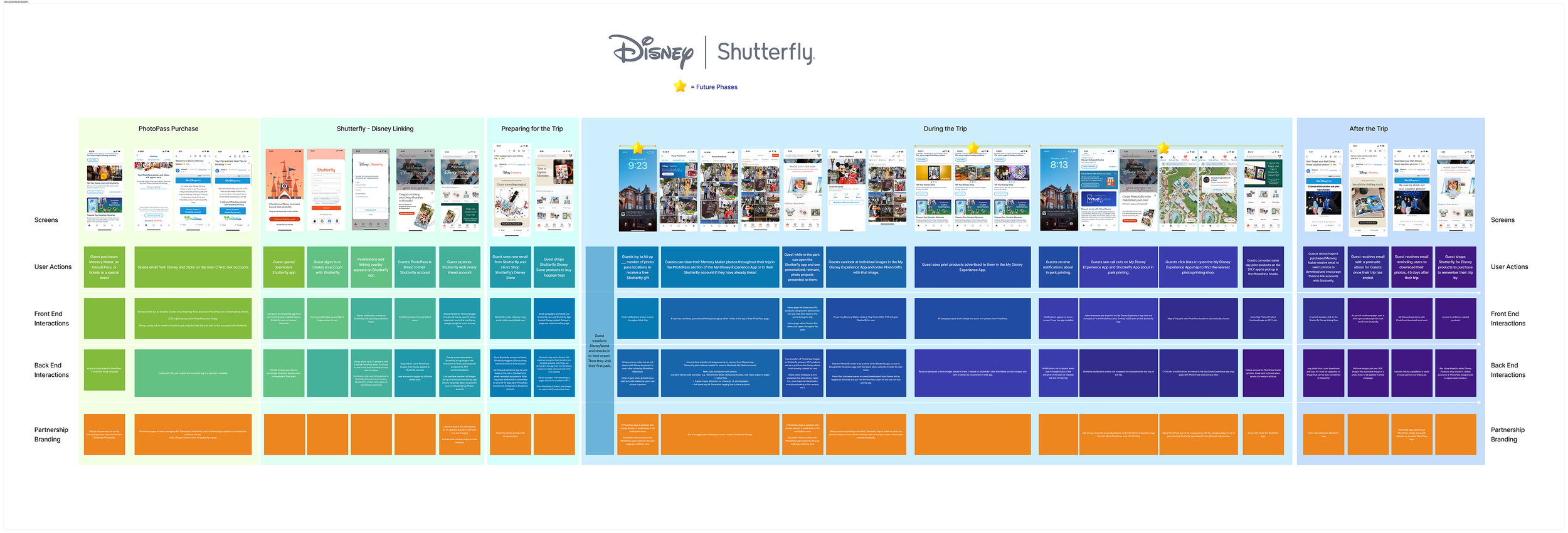
Stakeholder Flow
I collaborated with our Sr Director of Software Engineering and the VP of Product to collect all initial ideas around how to make an account linking flow work between two companies. Once we collected the items, I designed the above table to depict the user flow, the front end interactions, the back end interactions, and the partnership branding asks, to share our with our Disney stakeholders to discuss more requirements for the partnership.
Collaboration & Execution
Brainstorming and Prioritizing
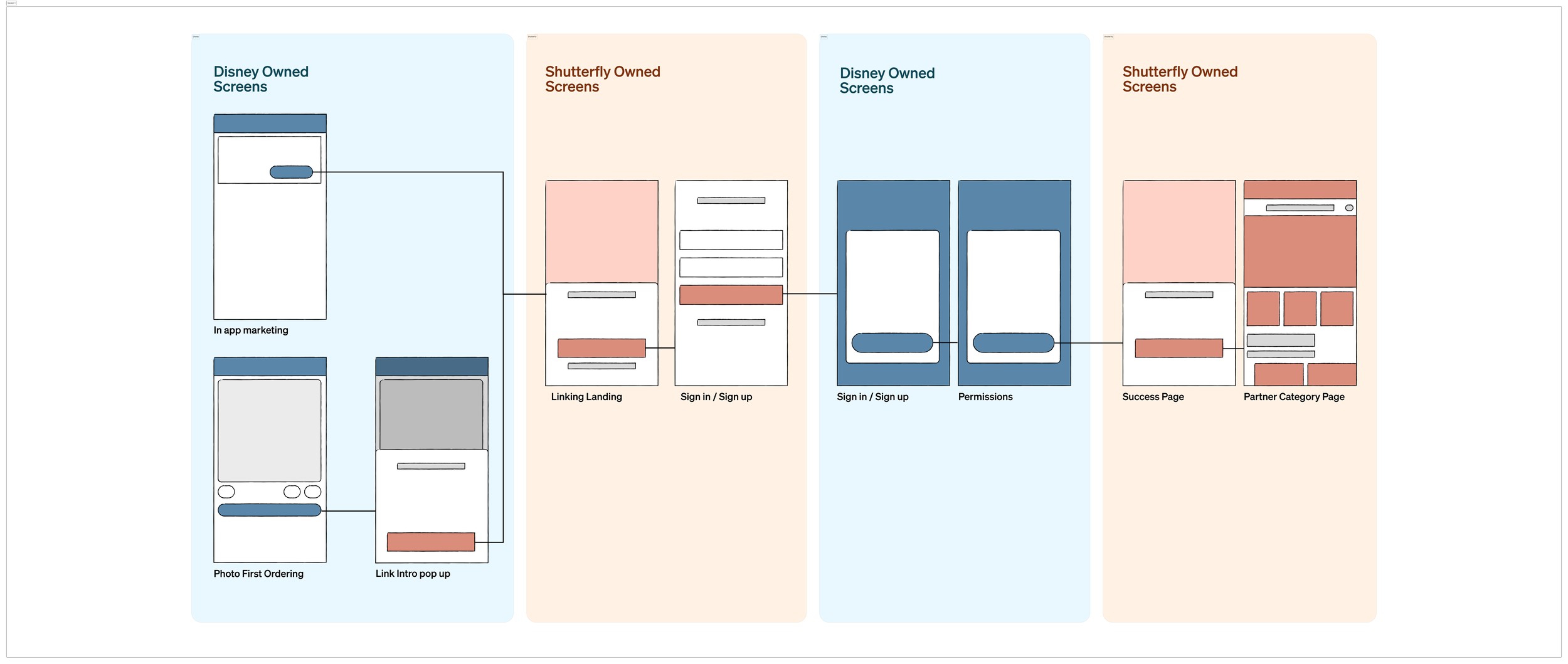
Initial Linking Wireframe Flow
As the sole designer, I acted as the glue between E-commerce, Merchandising, Creative, and Engineering.
Site Redesign Mood Board
We brainstormed collected inspiration for the new site on an Invision board. There’s a vibrancy about our environment that we wanted to capture to make the new site more fun and engaging but also wanted to have structure to keep it professional.
Prototype
Developing Layouts and Formulating
Wireframe Sketches to Lo Fi
Based on user interviews we knew that the new site needed:
Focused, helpful content on main page
Search bar featured
More visuals/typography and less blue hyperlinks everywhere
Breadcrumb navigation to help users know where they were in the site at all times to avoid getting lost or giving up
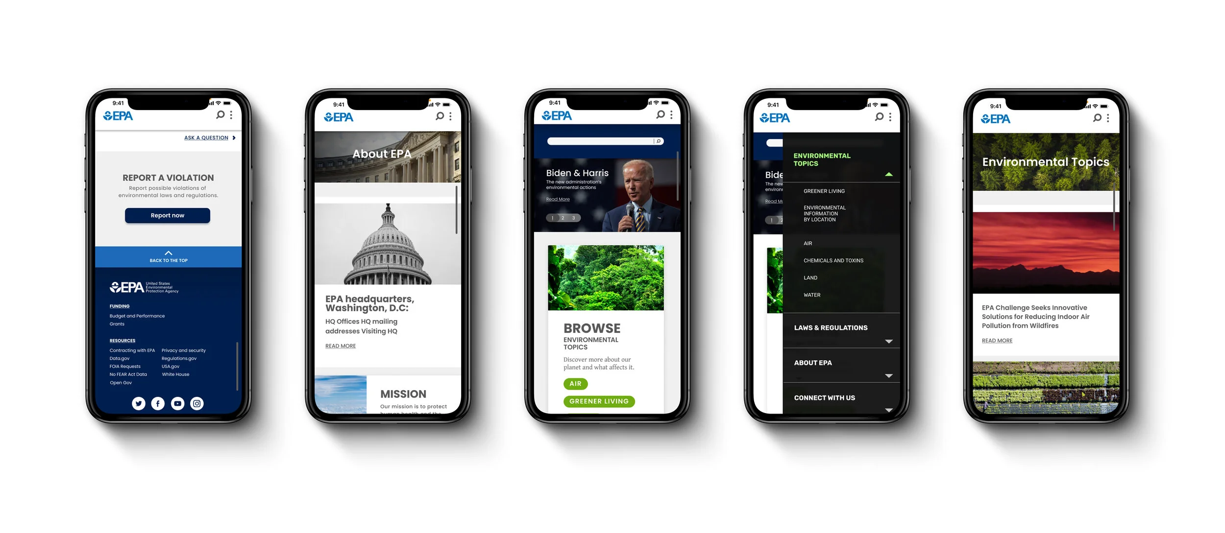
I drew this home page layout wanting to bring down the search bar into the main content area, and highlight EPA’s top two information categories: Environmental Topics and Laws & Regulations. I then turned this into a low fidelity wireframe for desktop and mobile.

Test
Testing Prototypes and Iterating

AB Testing - Search Bar Location
Initial user testing showed that users favored the search bar on a website to locate information. Because of this we wanted to see which layout gave users easier access to that search bar element.
The main takeaways:
100% of users located the search bar quicker when it was larger and located fully on the home page
Testers had to look longer to find the search bar when it was just an icon in the header
Style Guide

Hi Fi Prototype
I developed the high fidelity wireframe for the home page along with the Environmental Topics page and Connect with Us page. My partner developed the other three pages.
Hi Fi User Testing
The main takeaways:
Website has a consistent and well organized design
Users had trouble with interacting with the automatic drop down menu
“Connect with Us” as a menu label was not clear. “Contact” should be used instead
Need to reduce some font sizes for easier readability
Refine
Improving and Reiterating

Next Steps
EPA’s website is a resource page for users to find information. We can measure the product’s success by reducing the amount of time it takes a user to find the information they are looking for. This can be done in the following ways.
Develop more pages with consistent breadcrumbs and categorization
Design separate tab for EPA to host their research article library
Work with engineers to make sure search bar on site searches EPA’s site and not their research article library