

About the Project
The Challenge:
Farming Hope’s website was not effective enough at promoting information about the organization and needed to attract more donors.
The goal of this particular project was to identify any usability issues with current site and determine the critical features to prioritize for a more motivating donor experience in the next iteration of the product.
My Contributions:
Product Designer
User Research, Interaction, Prototyping & Testing
Time Frame:
4 weeks

The Process
Empathize
Research and Problem Definition
Proto Persona
User Interviews
Online Survey
Define
Identifying Key Issues and User Insights
Affinity Diagram
User Persona
Competitor Analysis
Ideate
Brainstorming and Prioritizing
Feature Prioritization Matrix
Storyboarding
Prototype
Developing Layouts and Formulating
Wireframe Sketches
Lo Fidelity Wireframes
Lo Fidelity Prototype
Test
Testing Prototypes and Iterating
Usability testing
Hi Fidelity Prototype
User testing
Refine
Improving and Reiterating
Next Steps
KPIs
Empathize
Research and Problem Definition

Who is farming hope?
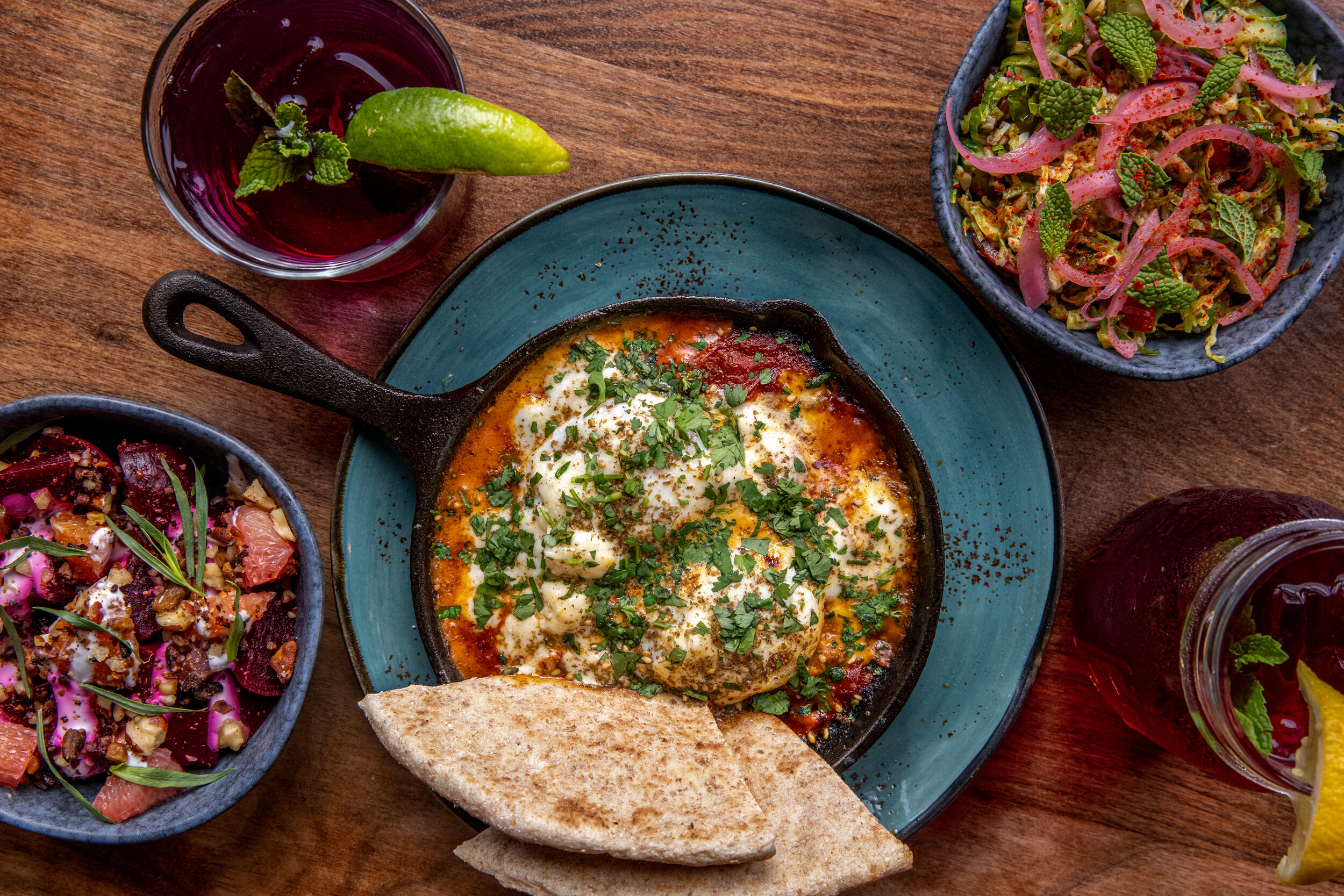
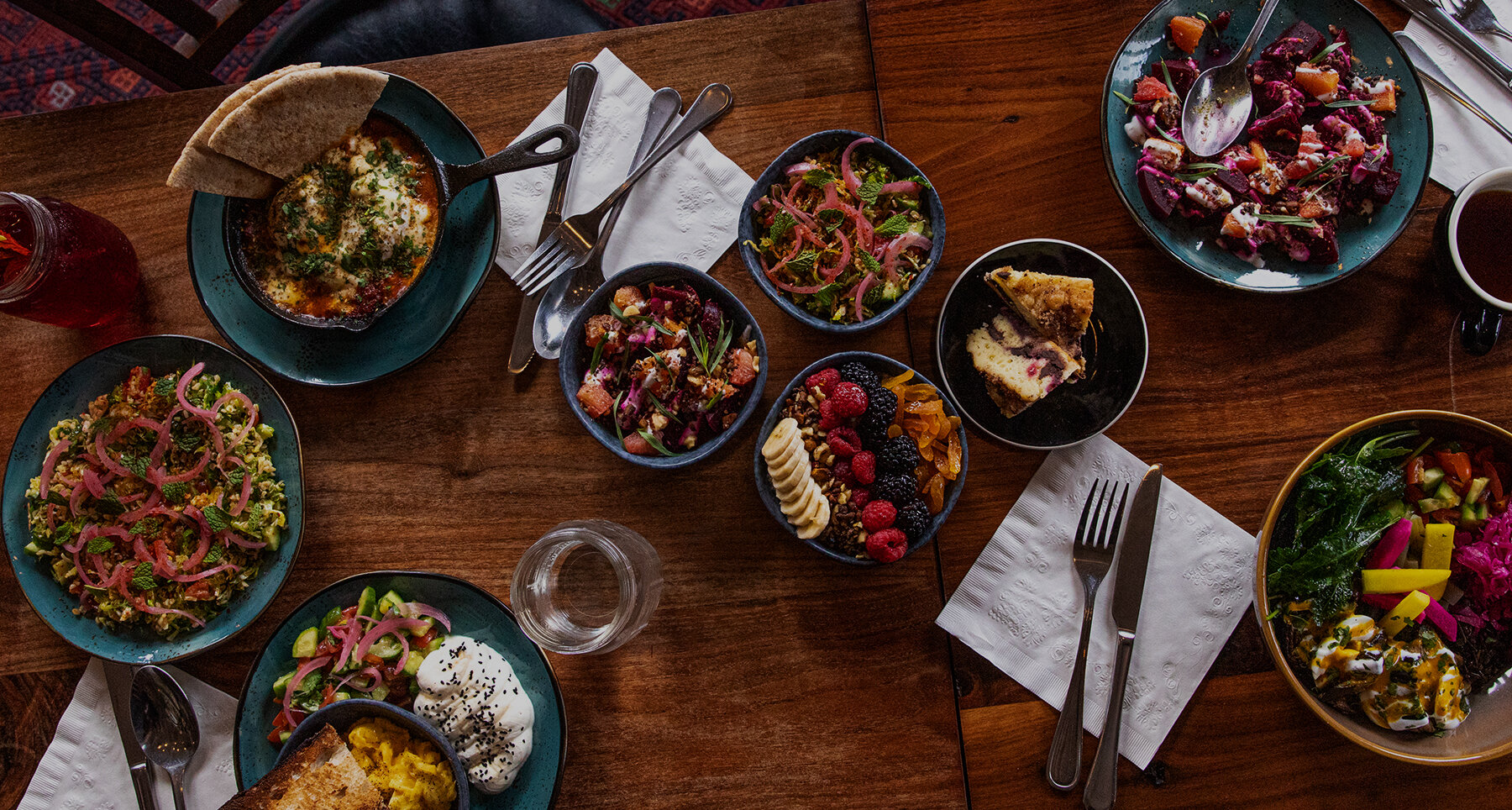
Farming Hope is a garden-to-table job training nonprofit. They offer paid, empowering transitional employment in their garden and kitchen with formerly incarcerated or unhoused neighbors.
Farming Hope’s Original Website

Gathering Insights
Interviews
We interviewed five individuals all between the age ranges of 25 and 35 who were frequent donors (more than three times a year) to get a better sense of what someone who donates often looks for in an organization and their website. . I conducted one of the interviews.
Research Objectives
To discover the main factors that inspire individuals to donate (time/ money) to an organization
To figure out how people normally find organizations to support (Through work, word of mouth, searching online, etc)
To find out if people are influenced by values when volunteering/donating?

“I prefer to support organizations that let me know where their money goes.”
— Miriam
“I love being able to see images of the people I’ve helped. It feels great knowing that my time and energy have been put to good use.”
— Caleb
Online Survey
Our team sent out a 9 question online survey to gather insight into what compels donors to donate and what qualities do they want to see in an organization they support. We had 144 responses and our top findings were:

A majority of donors make donations via their mobile phones.

The highest rated feature a donor wanted to see on an organization’s site was a description of where their money goes.

Donors are more willing to donate when they feel a personal connection to the cause.

Define
Identifying Key Issues and User Insights

Affinity Diagram
Each member of the team wrote out their main points from their user interviews. Then ideas were categorized into Types of Donations, User Qualifications Before Donating, Causes Donors Care About, Desired Qualifications in an Organization, Donor Rewards, How Donors Find Organizations, and Organizational Turn Offs for Donors.
What we discovered is that:
Donors want to clearly see what the organization does
Donors want specific projects to donate to
Donors like it when they can recognize that their money makes a direct impact.


Competitive Analysis
In order to gain insight on what other organizations are doing to promote donations and how Farming Hope measures up, we collected five other non profits in the Bay Area who providing food related or job training services. I put all of the team findings together in a chart to compare features. While Farming Hope hit most of the elements, they only have one or two examples on their website. We also discovered that they do not have an easily accessible annual report on their site, which will need to be included in the redesign.

Ideate
Brainstorming and Prioritizing

Feature Prioritization Matrix
After creating the affinity diagram, our team constructed the list of needs users requested in an I want, I wish, and what if categories. The top ideas were dot voted on and put into a feature prioritization matrix.
Features that needed to be included:
Imagery and stories of real people affected by the organization
A link to view the annual report
An online ordering platform
Storyboard
My team came up with the user story and then I drew the storyboard to show how it would play out.

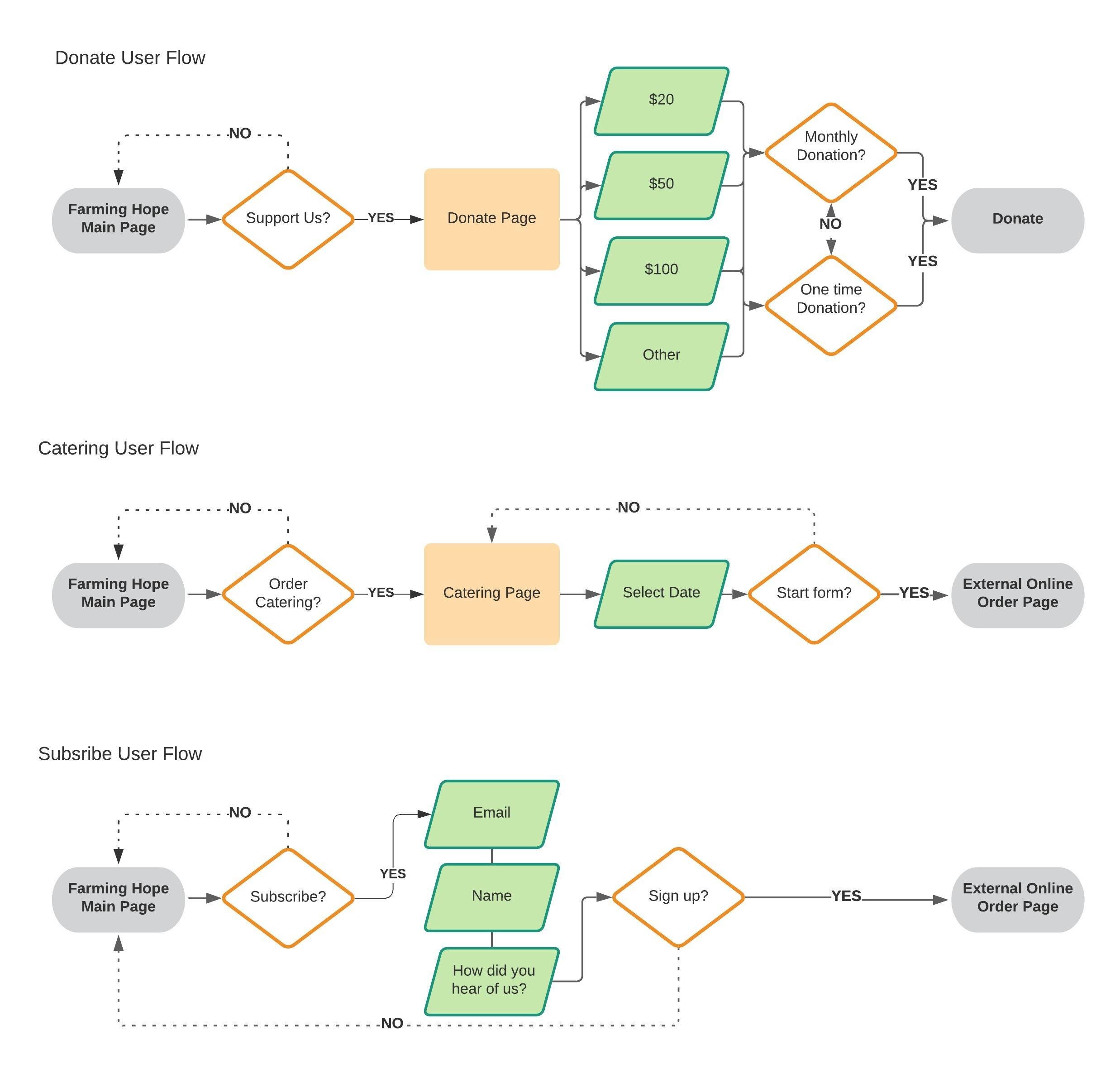
User Flows
Our team brainstormed what tasks a user might due when visiting Farming Hope’s site. The three main flows we decided upon were 1. Donate, 2. Order food, and 3. Subscribe to the newsletter. I developed these user flow displays in LucidChart.

Prototype
Developing Layouts and Formulating
Wireframe Sketches
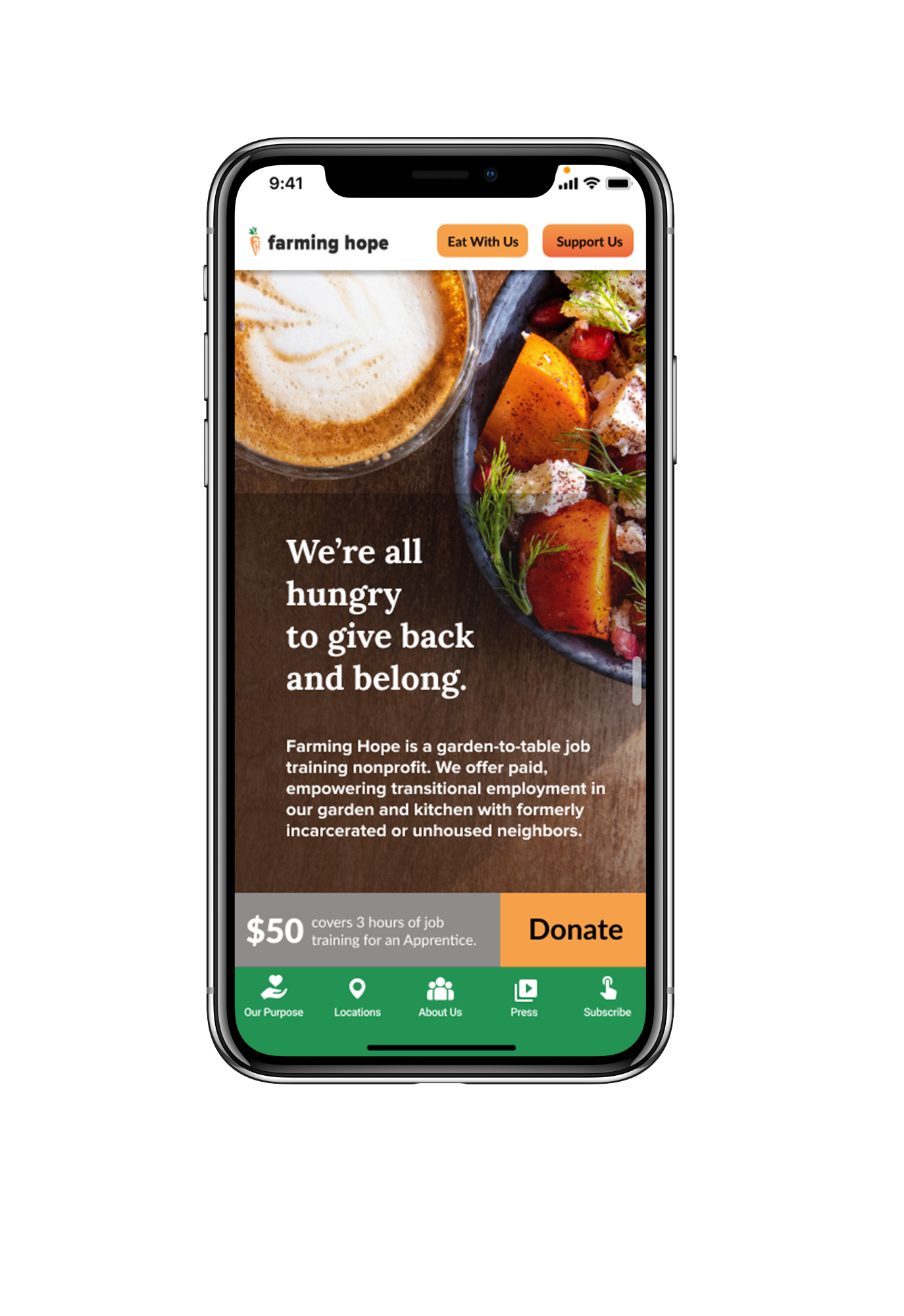
Based on user interviews it was clear that donors want to easily be able to figure out what the organization does and how they help others when visiting a website. In order to accomplish this, I wanted to design out a single page website layout. There would be a side navigation bar for users to jump to certain section headings and two feature buttons at the top to encourage visitors to order catering or donate to the organization.
All of my teammates drew up different sketch ideas and then we combined the top elements from each into a lo fidelity wireframe.

Lo Fidelity Wireframes


Test
Testing Prototypes and Iterating
Lo Fi User Testing
We conducted three user tests on our website prototype.
The three tasks tested were:
Locate a news article on their site
Subscribe to their newsletter
Give money to the organization
Seven of the nine tasks were completed successfully. Multiple users had difficulty locating the news articles on the site.
The main takeaways:
Layout of donation page was confusing with too many buttons. We needed to simplify.
Press needed to be its own section since users were not clear on the website scroll feature.
Style Guide
Write up about style guide

Hi Fi Prototype
Hey there. Let’s talk prototype.


Hi Fi User Testing
We conducted four user tests on our high-fidelity website prototype.
The three tasks tested were similar as before since the website is straight forward:
Locate a news article on their site
Subscribe to their newsletter
Give money to the organization
All 12 of the tasks were completed successfully.
The main takeaways:
Layout of donation page was confusing with too many buttons. We needed to simplify.
Press needed to be its own section since users were not clear on the website scroll feature.
Refine
Improving and Reiterating

Next Steps
Develop the “Eat with Us” page to start collecting catering orders
Create impact report microsite
Key Performance Indicators to monitor:
Number of donations
Percentage of visitors that donate
Amount of users who subscribe
to the newsletterNumber of orders made through
the website