
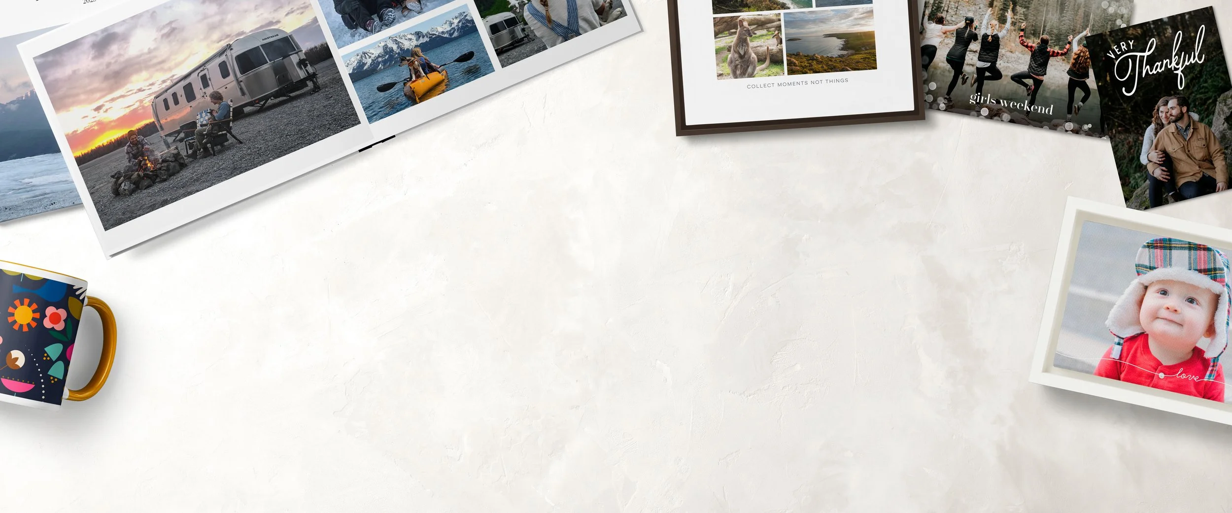
Shutterfly + Costco
COSTCO + SHUTTERFLY PARTNERSHIP
About the Project
The Challenge:
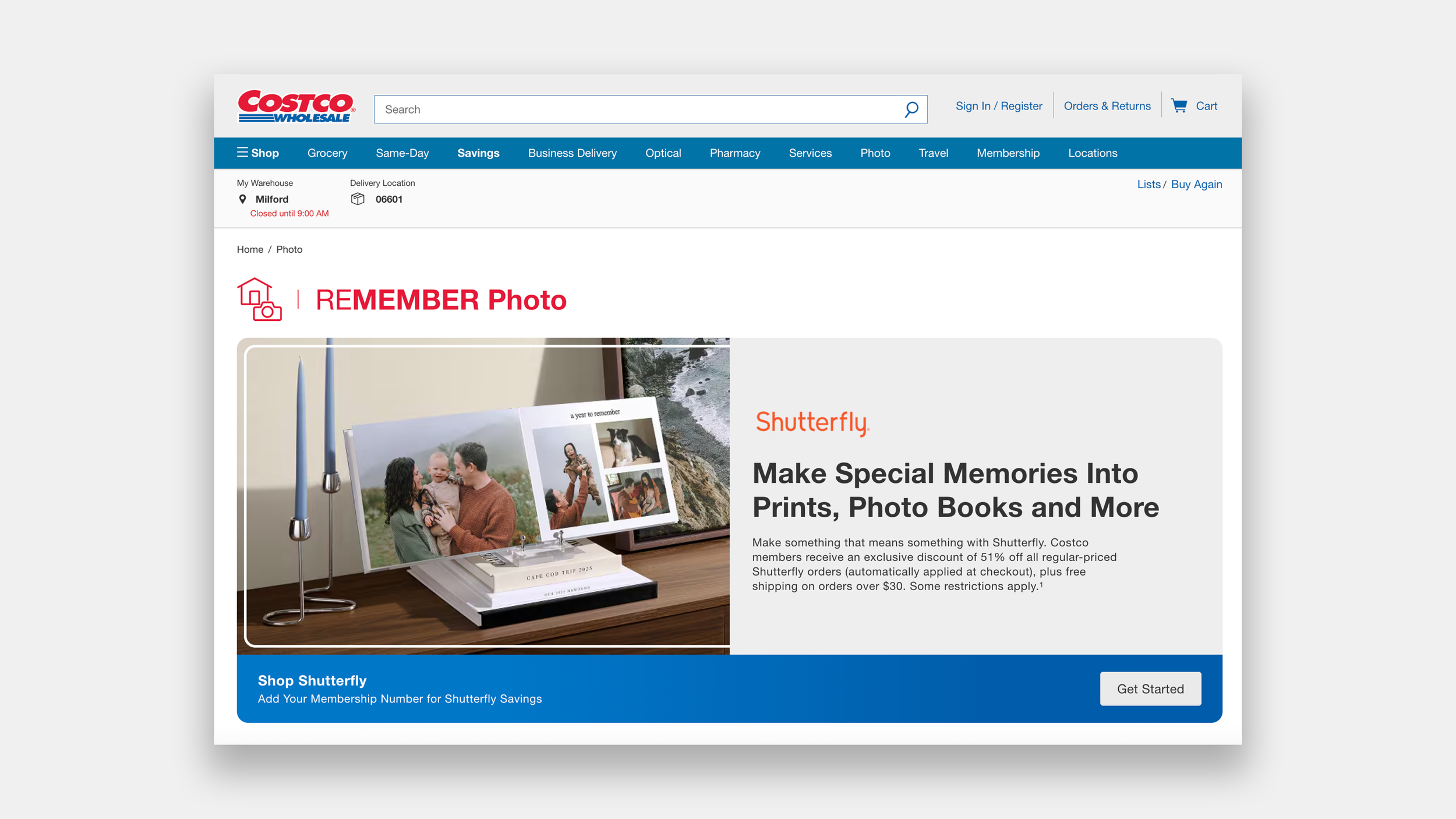
As Costco sunset its Photos business, it partnered with Shutterfly to continue serving its members’ printing needs. The challenge was to design a seamless UX that could onboard a large user base, securely transfer existing photo libraries from Costco to Shutterfly, and preserve trust throughout the transition.
In parallel, we needed to integrate a Costco-exclusive discount across the Shutterfly experience, ensuring members continued to receive the value they expected without added friction.
My Contributions:
Senior Product Designer II
Prototyping & Testing, UI Design
Team:
Audra Miller
Tools Used:
Figma, FigJam, Jira
The Process
Define
Technical Requirement
Red Lining
Navigational Usability Testing
Ideate
Mood Board
Card Sorting
Site Map
Prototype
Wireframe Sketches
Lo Fidelity Wireframes
Lo Fidelity Prototype
Test
Usability Testing
A/B Testing
Hi Fidelity Prototype
User Testing
Refine
Next Steps
KPIs
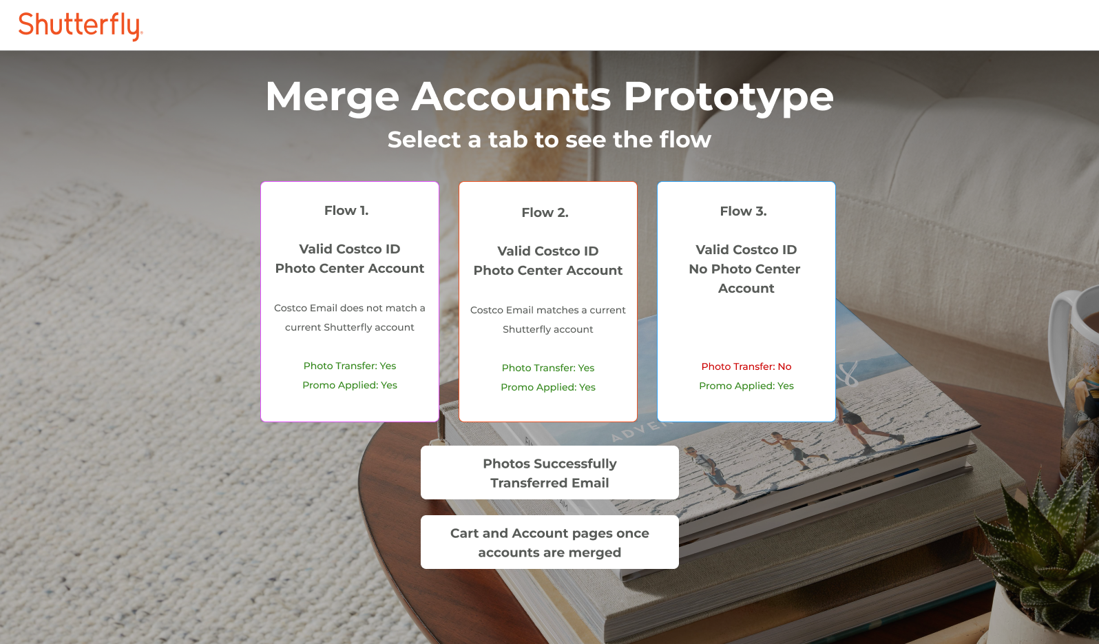
The Challenge
How to transfer over a million photo files
Passing the Photo Baton
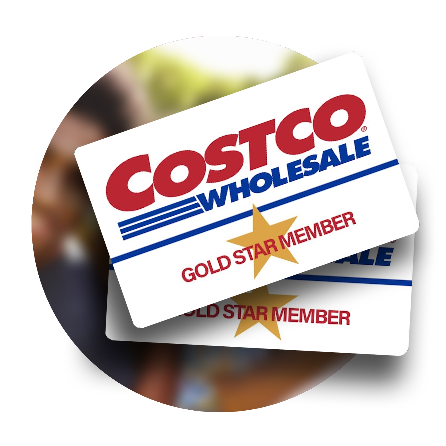
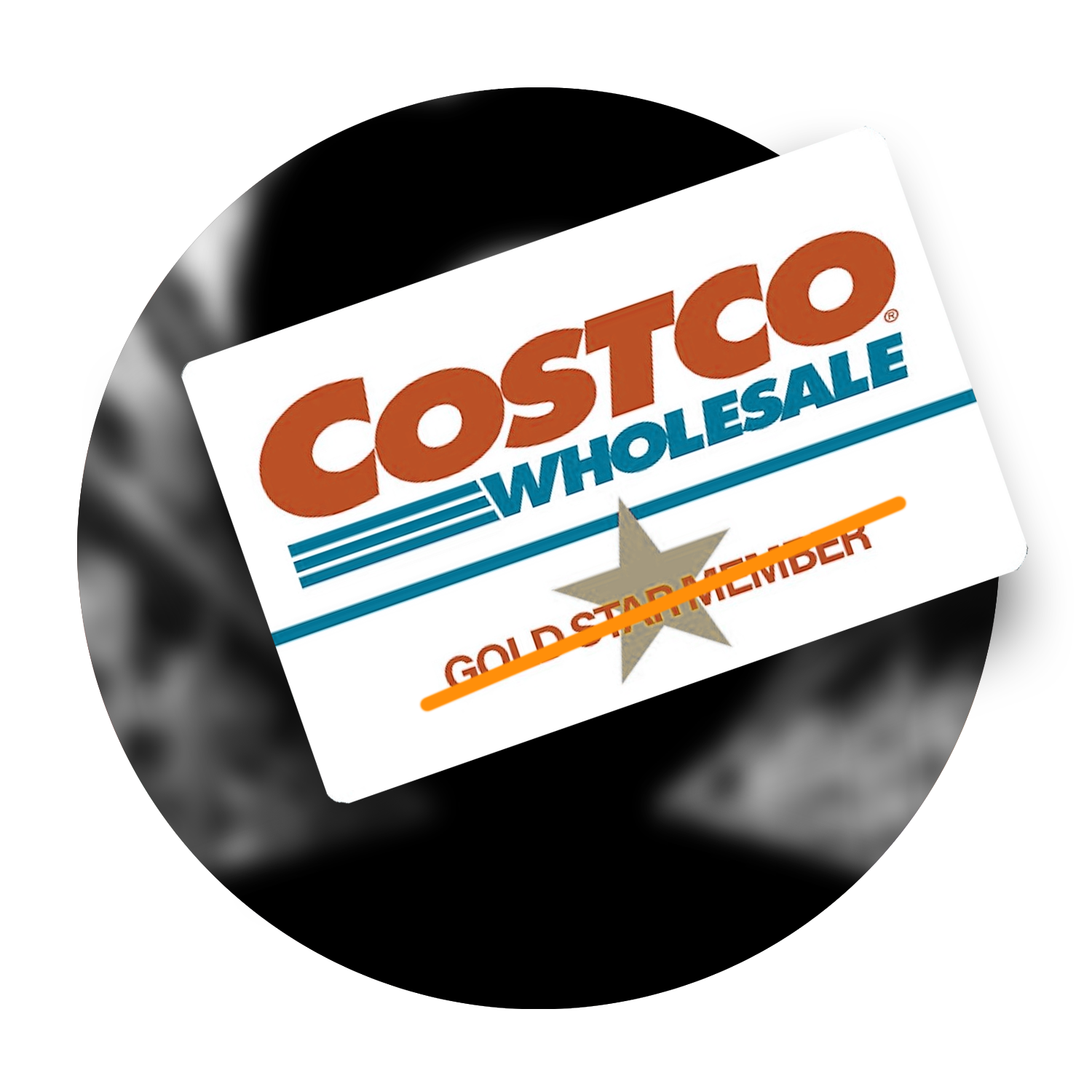
Costco decided to sunset their Photo Printing Services and set up to partner with Shutterfly to take on their customers. To encourage users to switch to Shutterfly, we agreed to provide 51% off all regularly priced orders and free shipping on orders over $30. As the sole product designer for this partnership, I met with Costco and Shutterfly’s PMs and Engineers to figure out how to solve the following questions.
Who all will be linking accounts?
How do we address family members who all share the same Costco Membership?
How can we make the experience happen with as few clicks as possible without disrupting our security integrity?
How do we communicate in our design clearly what is happening and how Costco plays a role during and after the linking?
Who will be linking accounts?
Costco Members with Images in their account that need transferring.
Costco Members that have no images but want to link with Shutterfly for a discount.
Costco Members on a family plan with multiple memberships that want to link.
Someone without a Costco Membership trying to get the Shutterfly Discount.
Passing the Photo Baton
Costco decided to sunset their Photo Printing Services and set up to partner with Shutterfly to take on their customers. To encourage users to switch to Shutterfly, we agreed to provide 51% off all regularly priced orders and free shipping on orders over $30. As the sole product designer for this partnership, I met with Costco and Shutterfly’s PMs and Engineers to figure out how to solve the following questions.
Who all will be linking accounts?
How do we address family members who all share the same Costco Membership?
How can we make the experience happen with as few clicks as possible without disrupting our security integrity?
How do we communicate in our design clearly what is happening and how Costco plays a role during and after the linking?
User Wire Flow
Typical User flow to locate the staff directory
Clicks on About EPA Tab on Home Page
Types in last name of person trying to contact
Clicks the individual’s name which is hyperlinked
Finds email address listed at the bottom of the profile page
Define
Identifying Key Issues and User Insights
Initial Research
Usability Testing
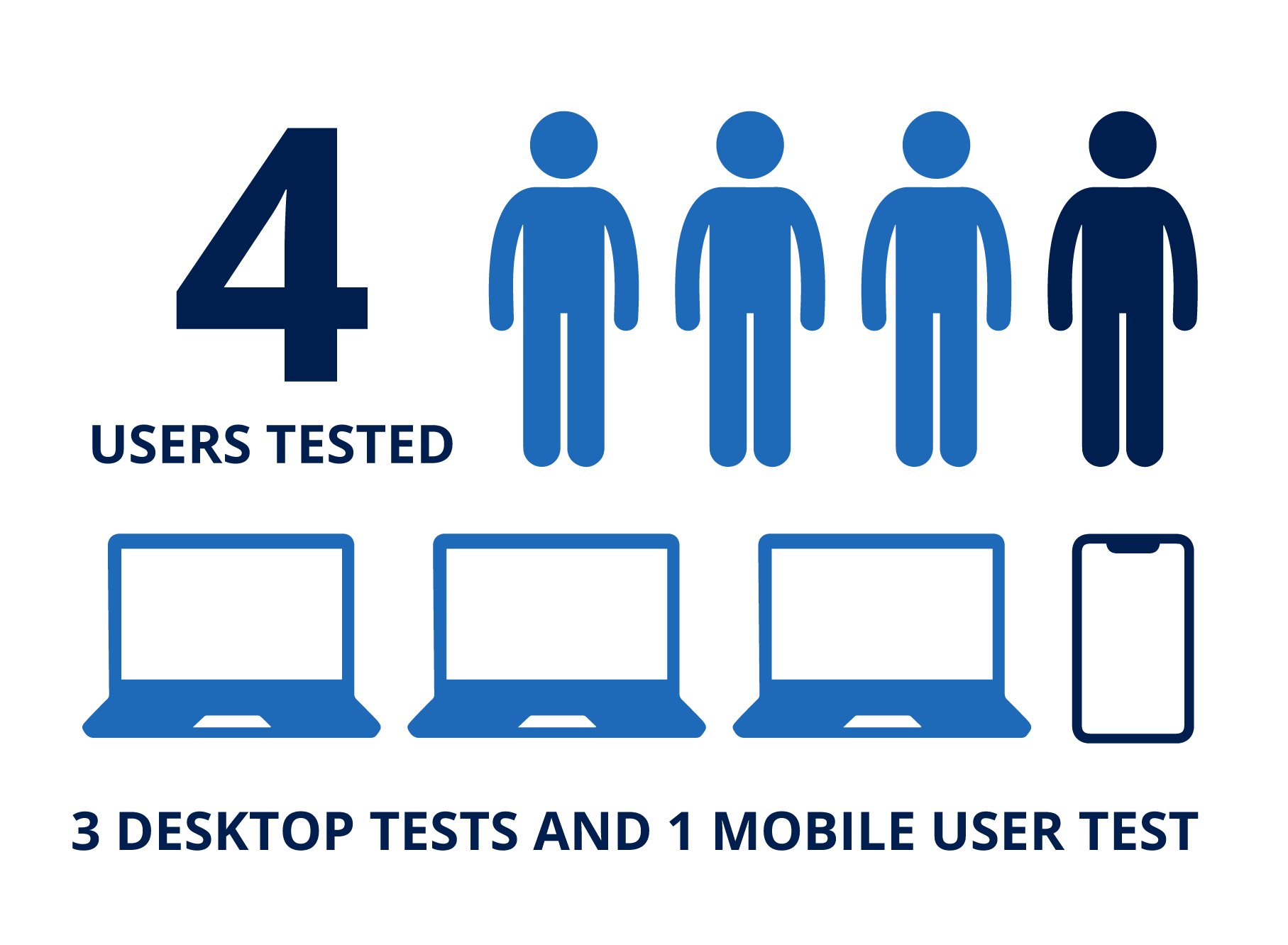
We interviewed five users, two of which were visually impaired to get a better sense of which pain points were most prominent in EPA’s website. I conducted two of the tests.
Testing Tasks
Figure out what the laws and regulations are for motorcycle gas emissions.
Find the email address for Alex Almario who works in the Gulf Ecology Division.
Find 3 different ways to improve the environment of a school.


Testing Pain Points
From our testing results, we constructed the list of the top frustrations in a graph to find out which would be the highest priority to work on and design for. The top pain points were:
Search Bar Efficiency
Users completed tasks easier by using the google search bar instead of the website’s search bar
Reduce Links
The site’s overwhelming amount of links persuaded users to go down many rabbit holes, wasting time and energy
Color Contrast
Some of the site’s colors were not contrasted enough for visually impaired users to easily read
Navigational Header Clean Up
Headers and organization of site needs to be tightened up. Users had trouble locating elements

Redlining EPA’s Current Website
Contact Us Links
There are three different ways a user can click to contact the EPA which is redundant.Icon Inconsistency
Social media icons and the icon for reporting a violation are inconsistent in sizing and color.Readability Issues
Body text color fails a contrast checker.Headings are not Effectively Titled
The main headings cause confusion for the user when visiting, wasting space on the main page.
Poor List Organization
Lists are not consistent and confusing making an overall muddy composition that is not easy to navigate visually.Link Overload
Far too many links on each page cause user exhaustion.
Navigational Usability Testing
We conducted four navigational tests on EPA’s website, three on desktop and one on mobile, to locate navigational user pain points.
The three tasks tested were similar to before but users could not use the site’s search bar:
The main takeaways:
Homepage content headers not clear or helpful
Staff Directory layout is confusing
Lack of breadcrumb navigation
Information overload without hierarchy caused user exhaustion
Ideate
Brainstorming and Prioritizing
Card Sorting
We each conducted two card sorting exercises with users. It early on was very clear that the topic headings without context were incredibly varied on EPA’s site. Users struggled figuring out which categories to put certain items.
Main layouts to focus on:
Collect all of the resource links together in one spot
Add context on main page about looking up environmental topics
Streamline the contact links and pages to be easier to navigate

Site Map
Based on our card sorting exercises, we constructed a new site map for EPA, reducing the amount of links on the main page.

Site Redesign Mood Board
We brainstormed collected inspiration for the new site on an Invision board. There’s a vibrancy about our environment that we wanted to capture to make the new site more fun and engaging but also wanted to have structure to keep it professional.
Prototype
Developing Layouts and Formulating
Wireframe Sketches to Lo Fi
Based on user interviews we knew that the new site needed:
Focused, helpful content on main page
Search bar featured
More visuals/typography and less blue hyperlinks everywhere
Breadcrumb navigation to help users know where they were in the site at all times to avoid getting lost or giving up
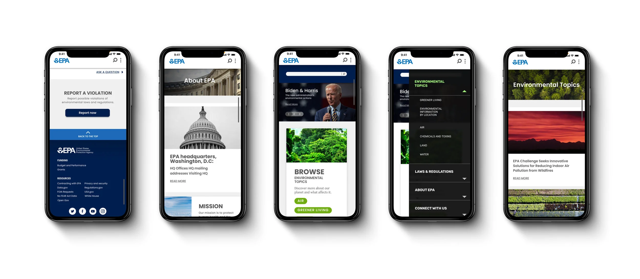
I drew this home page layout wanting to bring down the search bar into the main content area, and highlight EPA’s top two information categories: Environmental Topics and Laws & Regulations. I then turned this into a low fidelity wireframe for desktop and mobile.

Test
Testing Prototypes and Iterating

AB Testing - Search Bar Location
Initial user testing showed that users favored the search bar on a website to locate information. Because of this we wanted to see which layout gave users easier access to that search bar element.
The main takeaways:
100% of users located the search bar quicker when it was larger and located fully on the home page
Testers had to look longer to find the search bar when it was just an icon in the header
Style Guide

Hi Fi Prototype
I developed the high fidelity wireframe for the home page along with the Environmental Topics page and Connect with Us page. My partner developed the other three pages.
Hi Fi User Testing
The main takeaways:
Website has a consistent and well organized design
Users had trouble with interacting with the automatic drop down menu
“Connect with Us” as a menu label was not clear. “Contact” should be used instead
Need to reduce some font sizes for easier readability
Refine
Improving and Reiterating

Next Steps
EPA’s website is a resource page for users to find information. We can measure the product’s success by reducing the amount of time it takes a user to find the information they are looking for. This can be done in the following ways.
Develop more pages with consistent breadcrumbs and categorization
Design separate tab for EPA to host their research article library
Work with engineers to make sure search bar on site searches EPA’s site and not their research article library