
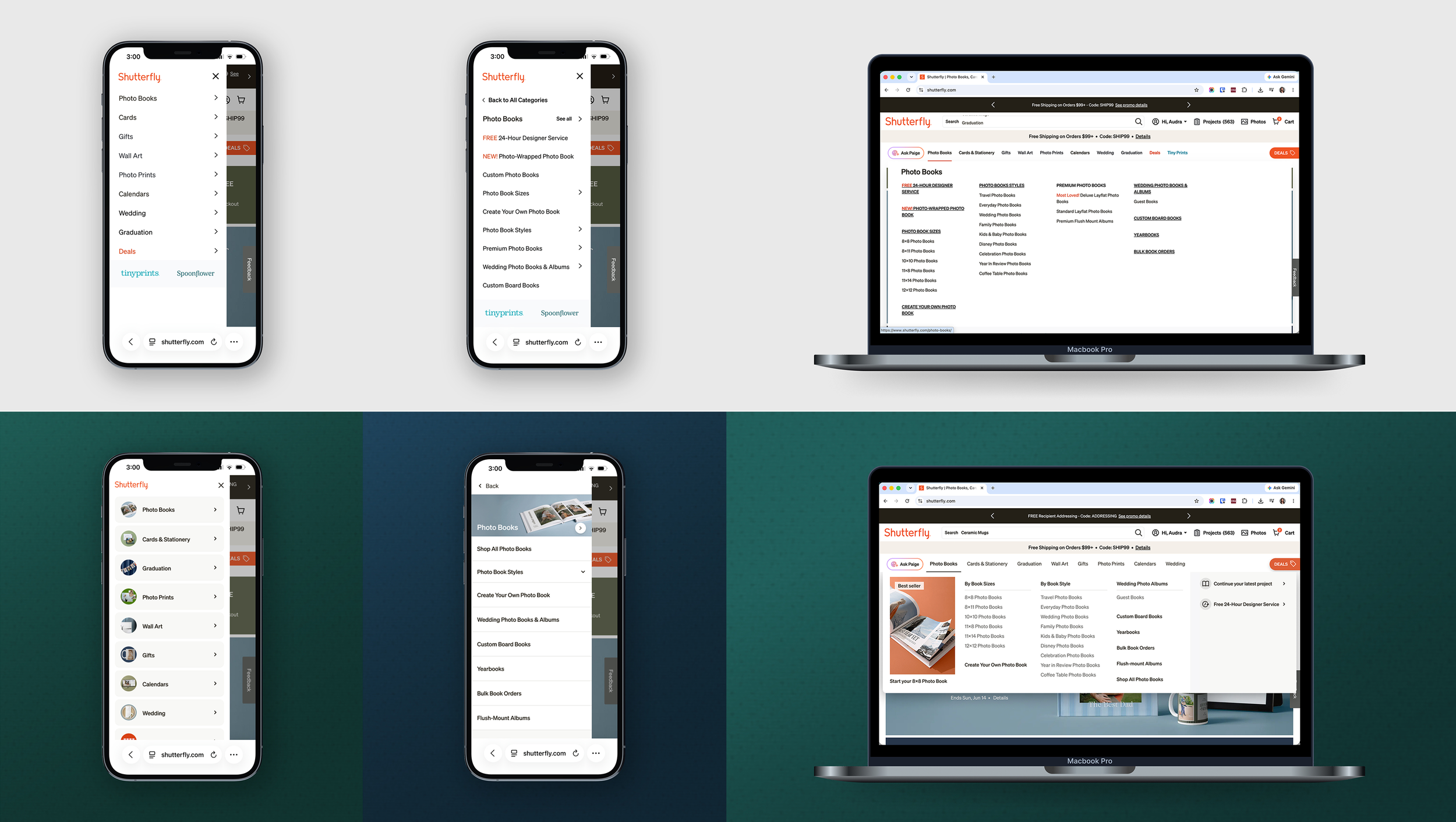
Refreshing the look and feel of Shutterfly
The struggle of championing for modernizing.
Shutterfly Main Navigation
Shutterfly had not touched the look and feel of it’s navigational menu in many years. It was time for a refresh.
Many of the product decisions at Shutterfly were only moved forward if you could directly prove that it would help increase revenue.
Since it’s so hard to produce a solid KPI for modernization, a lot of the site revamping was put on the backburner.
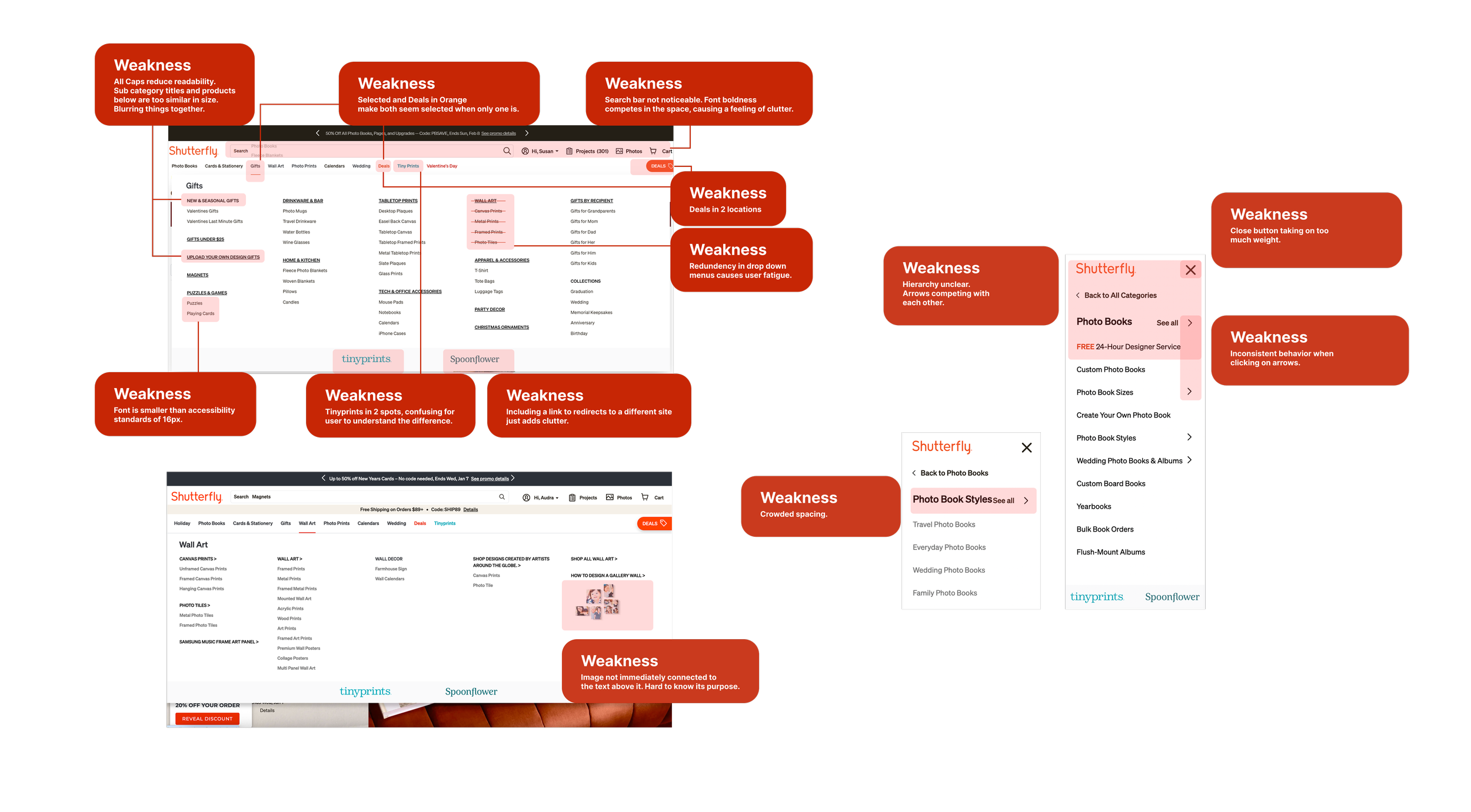
Redlining The Current
As a foundation for this project, I started by doing an redlining report of our current desktop and mweb navigation to mark areas of weakness. There were a lot.
Our E-commerce team had did not have a record of customers complaining that they had trouble finding items in our nav we needed evidence of what we needed to improve.
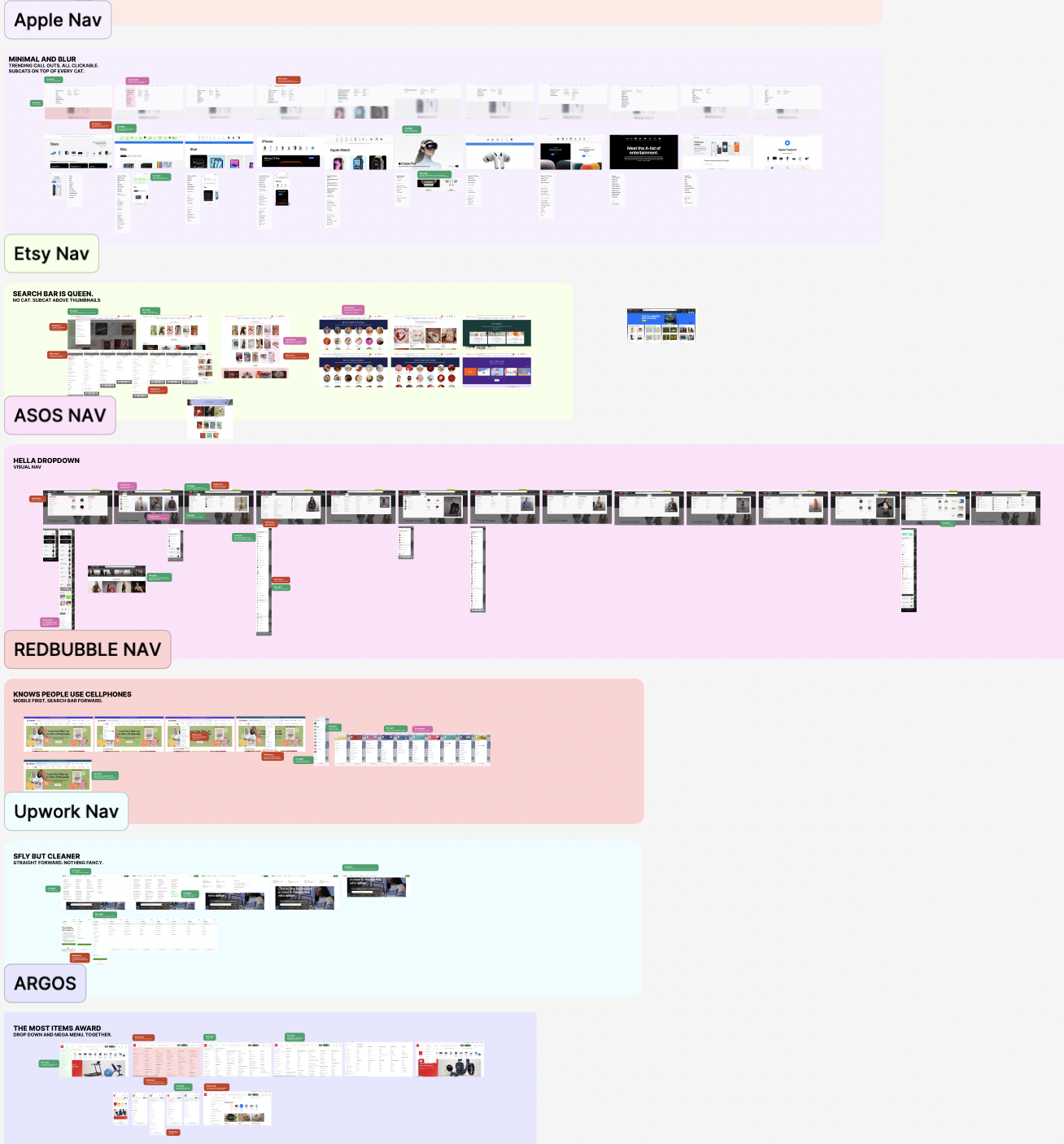
Competitive Audit
As a foundation for this project, I started by doing an audit of our current desktop and mweb navigation to mark areas of weakness. There were a lot.
Our E-commerce team had did not have a record of customers complaining that they had trouble finding items in our nav we needed evidence of what we needed to improve.
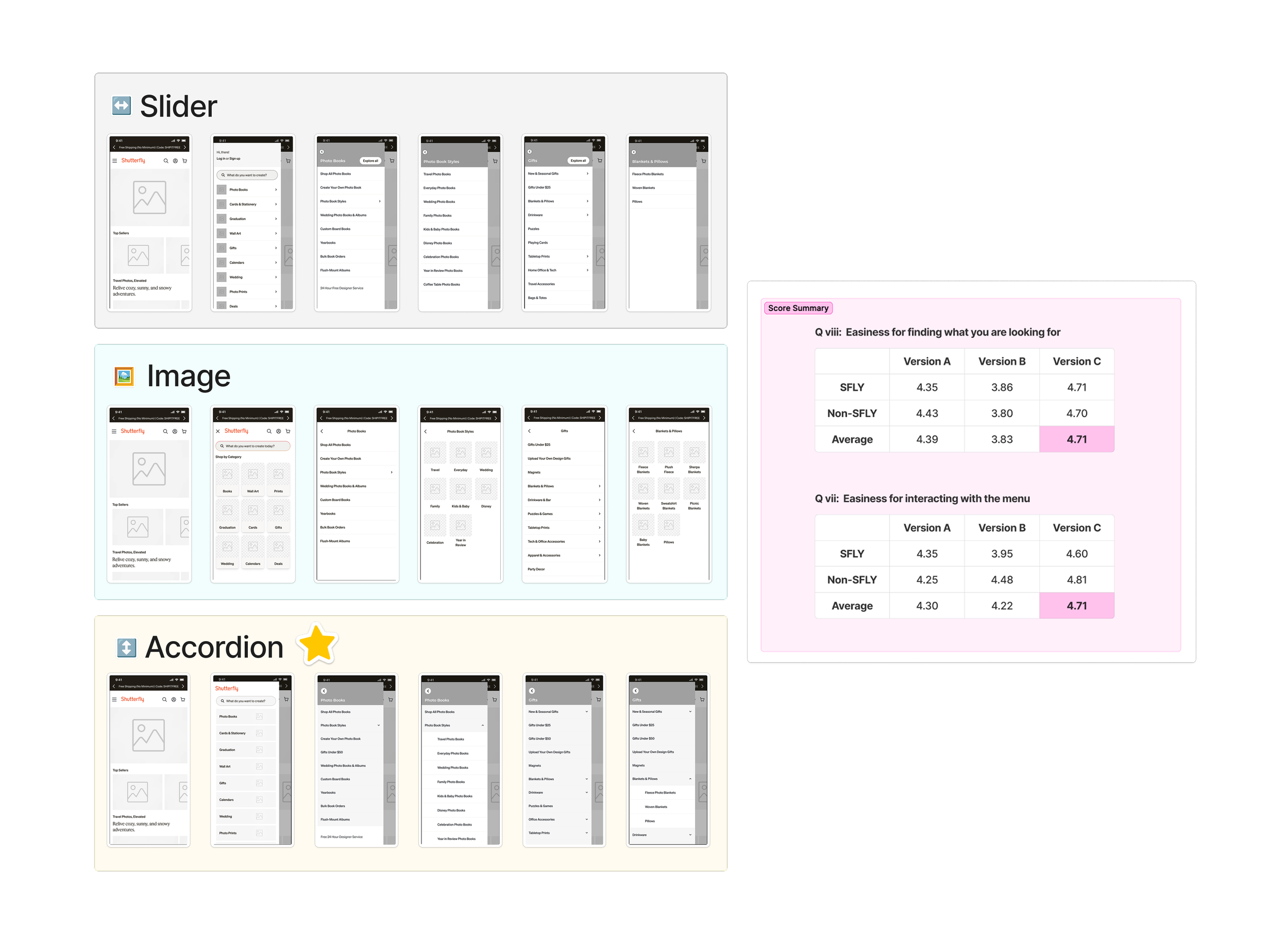
User Testing
Shutterfly had not touched the look and feel of it’s navigational menu in many years. It was time for a refresh.
Have an idea in mind? Let’s make it happen.